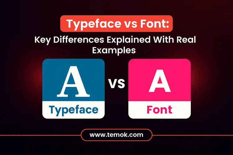
It’s easy to confuse the words “typeface” and “font” when selecting the ideal style for your website or brand. Typeface vs font are sometimes used interchangeably, even in some online tutorials, although they signify distinct things.
Teachers may have asked you to compose your essays in a specific font when you were a student; consider Times New Roman or Arial. However, it turns out that those fonts are actually “typefaces” rather than fonts. Furthermore, despite their frequent interchangeability, the phrases have distinct meanings. Although it might not seem like much, understanding the difference between type and font might help you better grasp typography and hone your design abilities if you’re interested in graphic design.
Keep reading and exploring to learn what is the difference between typeface and font. We will also explain the different kinds of font vs typeface so that you can better understand.

Table of Contents
What is Typeface?
So, is Helvetica a typeface or a font? It is a typeface by traditional definitions. What is a font, though? A typeface, commonly referred to as a family of fonts, is the design of the text. The primary stylistic decisions in typography, such as the ideas it conveys and the functions it fulfills, all have a link to the typeface rather than the font. According to this definition, Helvetica is a typeface.
So why are Helvetica, Arial, or Times New Roman types of fonts? The digital age, when Microsoft Word only had fonts and no typefaces, is when the names first became confusing.
This is also partly because mass digitalization rendered the differentiation less important: when typeface, font size, bolding, and italicization can be done with a few clicks, why worry about particularities?
What are Different Kinds of Typefaces?
Typefaces come in a variety of styles. From a branding standpoint, the typeface you choose will prove crucial to your digital branding ability to stand out and convey its identity.
Selecting a font type that complements your brand is crucial. Here are some of the kinds of typeface in our typeface vs font differences:
Serif

Small lines, or “feet,” appear at the termination of strokes in serif fonts. They are ideal for news websites, legal companies, and blogs that wish to appear timeless since they have a conventional, official, and trustworthy vibe.
Sans Serif

Sans means “without,” as the name implies. Without superfluous “flourishes” or those lines at the end of the strokes, these fonts are crisp and contemporary. Due to their digital readability, they are excellent for use on applications and websites. They are also widely popular in usage in tech branding, landing pages, user interface design, and other fields.
The Script

Script fonts tend to resemble handwriting. You may have seen them on artisanal branding, invitation cards, website headers, and more. They feel more sophisticated, unique, and creative. Taglines also regularly employ script fonts, typically to establish relatability.
What is a Font?
What exactly is a font if Helvetica is a typeface? A text font is a subset of a typeface that has certain dimensions, weights, and other characteristics.
Helvetica Bold 16 point is one type of typeface. Additionally, it is not the same as Helvetica Neue UltraLight 12 point. The term font (formerly “fount”) comes from the Old French verb fondre, which means “to pour out, melt, smelt,” and has a link with the ancient practice of writing text on metal blocks. Helvetica Bold 16 pt and Helvetica UltraLight 12 pt were, in fact, very different back then, requiring a distinct set of metal blocks for each typeface.
In typeface vs font, using the Times New Roman example from earlier, Times New Roman Bold 14pt is an example of a font, even if Times New Roman is a typeface. Although it is a component of the font, it has a scale of 14 points in size and a beautiful design for emphasis (hence bold).
Consider fonts that mimic a typeface’s technical implementation. Choosing a font—not simply the typeface—with strong and bigger headers and regular and smaller body text is a common practice when writing CSS code for your website or creating an email newsletter.
What are Different Kinds of Fonts?
Here, you could find a few font kinds. In our font vs type comparison, the majority of fonts feature the following three, while some have even font kinds such as semi-bold, extra-light, and thin:
Regular

There are often no bold or italics; this is the default. These are ideal for lengthy body content since they are clear and uncomplicated.
Bold

Popular in headers, callouts, key phrases, or buttons on websites to highlight a term or subject.
Italic

Like bold, the slanted design is utilized to make a statement. Quotes, subtext, subtle emphasis, and stylistic flair can all benefit from these.
Fonts have the power to provide consistency in your overall appearance and build or destroy your brand identity. Now is the time to discuss major typeface vs font key differences.
Also Read: Landing Page Best Practices: How To Turn Visitors into Customers
Typeface vs Font: Key Differences
Here are the key font vs type key differences:
Short history
In the early days of printing, along with metal typesetting, when characters were placed on metal blocks to be physically stamped on paper, the names “typeface” and “font” first appeared. Fonts were separate sets of those metal blocks for a certain size and weight of that design, whereas printers employed a typeface to direct the overall design of the letters.
Times New Roman 10pt Bold and Times New Roman 12pt Italic, for instance, were two different typefaces that necessitate different molds and supplies.
Physical type is no longer necessary due to the growth of digital marketing and typography. The difference between type and font grew hazy when fonts have developed into software files (.ttf,.otf). Many individuals began using the two words interchangeably at this point.
Nonetheless, the font and typeface difference are still relevant and present in professional branding and design contexts. Knowing the font or typeface variation will help you in your branding efforts, whether you’re creating a website, logos, newsletters, or flyers.
Dimensions
A font’s size is often expressed in points, where one point is equal to 1/72 of an inch. The size of the text on the page or screen is determined by this option. In order to establish hierarchy and contrast in a design, several widths of the same typeface might be employed.
Weight
The thickness of the characters of a typeface is referred to as its weight, while comparing typeface vs font. Light, normal, medium, bold, and black are examples of common weights. The overall tone of the design and the text’s legibility may be greatly impacted by the weight. You can use strong typefaces sometimes in headings, for example, to draw interest.
Length
Fonts with different widths are included in certain typefaces. Condensed or narrow variants as well as extended or broad versions are possible. A font’s width may affect how dense the text is and how much room it takes up on a squeeze page or screen.
Slope
A font’s inclination is referred to as its slope. Oblique and italic typefaces are slanted. Although they are sometimes used interchangeably, there is a little distinction: slanted fonts are just slanted copies of ordinary fonts, but italic fonts have a different design from regular (or roman) typefaces.
Is The Font And Typeface Difference Really That Important?

Although most individuals use the terms typeface or font interchangeably, professionals with training in typography, type design, or graphic design should be aware of the distinction.
The phrases typeface vs font are from the early days of printing. Type foundry has produced the letters of solid metal traditionally. Letter by letter, a typesetter would set the metal type on each page. These metal letters were placed in narrow wooden drawers, called work cases. In the cases, every letter, number, and symbol had its own compartment. The phrases uppercase and lowercase came from the fact that capital letters were kept in the drawer above lowercase letters in older work cases.
Also Read: Personal Website Examples: Inspiring Designs To Spark Your Creativity
Every typeface or variant, such as strong or condensed, has its own casing. The typesetter can therefore determine exactly the size type to use on the page by identifying the font. It was crucial to keep the typefaces in the job cases coordinated. Making time-consuming errors might result from using the incorrect typefaces on a page.
Operating systems’ naming conventions make it difficult to distinguish between the phrases as desktop publishing gained popularity. Software asks you to select a font rather than a typeface when you create a document. There is no difference between a font and a typeface while working with a computer file.
Conclusion
Knowing the typeface vs font differences can thus help you to significantly improve your typographic skills. It enables you to select typefaces for your designs with greater knowledge, producing more visually appealing and functional results. Keep in mind that typography is a potent instrument for communication and aesthetic appeal to making content understandable.
A font is how that visual personality is stylized and used in context, whereas a typeface is the visual personality of your text. Whether used in headers, body text, or labels, fonts give a typeface life and help your message feel consistent, clear, and on-brand. Comment below if you have any queries about the font vs type differences.
FAQs (Frequently Asked Questions)
What Is The Difference Between Font And Typeface?
A font is a specific text style, weight, and size within a typeface, whereas a typeface is the general design of a group of letters. It is the main difference if you compare typeface vs font.
Is Arial A Font Or A Typeface?
Taking its inspiration from nineteenth-century sans serifs, Arial is a neo-grotesque typeface that is a regular font to create a unified font family and become better suited for continuous body text.
What Is The Difference Between Lettering And Typeface?
These fonts may have a slight change in size, weight, and style to express various ideas or arouse particular emotions. They have a design that is readable and aesthetically pleasing. However, lettering entails producing one-of-a-kind hand-drawn or digitally created letters.
Is Typeface Another Word For Font?
Although typeface and font are sometimes used interchangeably, it is more correct to refer to a typeface as a “font family,” which is a collection of typefaces with related designs. Official names for typefaces include Helvetica, Comic Sans, and Garamond.